RTiiikA
Rosa ter Kuile's (aka RTiiikA) artwork explores urban art and its reception within the community, as well as design and typography. Her iconic shapes, reduced to their simplest form, not only capture the viewer’s attention but also carry a distinct political message, addressing social and cultural issues that encourage critical reflection. This approach allows her work to be both an aesthetic experience and a starting point for analysis and discussion of contemporary issues.

Rosa at her studio in Bristol - by Mercedes Polo Portillo
In this series of WMN Meets Bristol-Based Artists I believe it’s essential to include your work, as you’ve been an integral part of many creative initiatives in the city and have left a lasting mark with your vibrant murals. I’ve been following your art for quite some time, and it’s truly a privilege to have this conversation with you. I’d love to dive deeper into your artistic practice and background. Could you start by sharing your early experiences with art?
My practice has evolved through several phases. Growing up, I spent my summer holidays in Holland with my family, and during that time, I would often visit my grandma’s basement studio. I’d stay with my grandparents for about two weeks, and she always had a creative activity planned, like making papier-mâché flowers. There was always something artistic to engage with whenever I was around her.
I feel privileged to have attended a school that prioritized creativity. From a very young age, I was involved in activities beyond just drawing or colouring, including pottery, weaving, and gardening. However, this actually had the opposite effect of what I expected—I left school wanting to become a lawyer. It wasn’t until my mid-twenties that I realized I truly wanted to live a creative life, so I set out to train myself for that path.
Although my parents aren’t directly involved in the art world, they’ve always been very supportive of creativity in life.

RTiiikA´s archive
The human form has been a consistent theme in your work. What draws you to express yourself through physical representation?
I experimented with many different styles, and while going through old folders on my laptop, I realized just how diverse my approach had been. Since school, I’ve often been told that I tend to rush things, and my drawings are usually done quickly. I used to view this aspect of my work as a negative trait. For a while, I was very focused on finding my creative style and figuring out how my drawings could resonate with people. I remember seeing Keith Haring’s work and thinking, "This person built an incredible career with simple stick figures," and it made me realize that I didn’t have to create complex 3D drawings. What I really wanted to achieve was simplicity—how can I convey something in the most straightforward way? This is why I started my project on road signs: it's about communicating a message that people can understand in just a few seconds and applying that concept to art.

RTiiikA´s archive
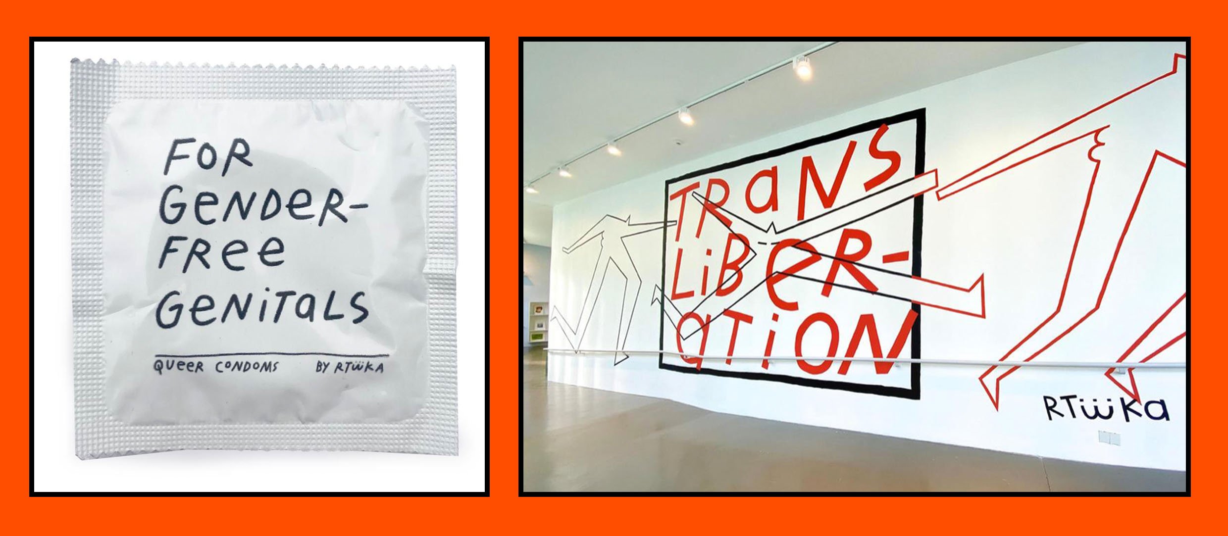
The fun and playfulness in your pursuit of queer freedom manifest in a symbolism that runs throughout your work. What is your conceptual intention behind this discourse?
I think it’s essential for me to create work that can address more serious subjects while also allowing space for something playful or silly. I sometimes get stuck in the mindset that every sketch needs to be a significant piece of art, which can limit my creativity.
My relationship with my partner has a significant influence on my work. She researches pain and pleasure and has a queer theory background, so we often have conversations about various topics. At first, I was a bit closed off to other perspectives, but being open to these discussions has allowed me to create artwork from a more thoughtful standpoint. It has greatly helped me develop my critical and political approach to art.
Conceptually, I may not be academic in terms of how I speak or read, but I deeply connect to the stories unfolding and the symbolism behind the shifts in paradigm.
RTiiikA´s archive
The flat colours you often use evoke the style of screen printing and poster designs. Can you tell us about your connection to urban art?
From the beginning, when I realized I wanted to draw, the idea of creating something on a large scale was a real dream. There’s something extraordinary about seeing your designs bigger than you—it's probably a feeling similar to what an architect experiences when a building is completed.

RTiiikA´s archive
The large scale also allows you to fully express your ideas. With so much space to work with, there’s something truly epic about sharing it with the rest of the community.
It’s a unique feeling, and while I’m drawn to performance, what I love about public art is that with street art, you can create something without being on stage, yet still witness people engaging with it, maintaining a sense of anonymity. I enjoy the process of finding a spot in the city and considering how people will interact with it—not just thinking, “I want to make this really big,” but also considering the context.
The first mural I created was while I was working for Grow Bristol (which no longer exists), an urban farm that grew small salad greens. I worked as their delivery person, and they had a great wall space. That's where I painted my first two-color mural.

RTiiikA´s studio by Mercedes Polo Portillo
Your creative connection with posters involves a graphic discourse where typography takes center stage. Where do these ideas stem from, and what is your intention behind sharing them?
It developed naturally. I felt like I needed permission to incorporate text into my artwork, as I mistakenly thought it wouldn’t work or might come across like a comic strip. But I’ve come to realize that adding text can actually complement and provide context to the visuals. For a long time, I’ve been fascinated by how people create their own alphabets, so I have a book where I asked people to write out their alphabet for me. Much like how we practice our signatures, I’ve spent a lot of time practicing my own alphabet, and it has evolved into what it is now.
I’m also inspired by the work of Sister Corita Kent, the radical nun who used screen printing for activist art and always worked with text and color blocks. For me, seeing others use text in their work has been incredibly influential.

RTiiikA´s archive
Political context seems to play a significant role in your work. Do you consider your art to be activist in nature?
I enjoy exploring realities that are often overlooked, encountering them through collective efforts. That’s what I aimed to do with the Bristol Mural Collective. In 2019, I began to realize the incredible talent of the artists working in Bristol, and I decided to create a platform where we could all come together and paint in public spaces. One of the main goals was to give social empowerment to the group, and we’ve collaborated with various charities, such as the Palestine Film Festival.

RTiiikA´s archive
❋ ENTREVISTA EN ESPAÑOL ❋
El trabajo de Rosa ter Kuile (aka RTiiikA) oscila entorno al arte urbano y su recepción en la comunidad, el diseño y la tipografía. Sus icónicas morfologías, reducidas a lo esencial, no solo capturan la atención visual, sino que también reflejan una clara impronta política, abordando cuestiones sociales y culturales que invitan a la reflexión crítica. Este enfoque permite que su trabajo no solo sea una experiencia estética, sino también un punto de partida para el análisis y la discusión de temas contemporáneos.
En esta serie de WMN meets Bristol-Based Artists creo que es esencial incluir tu trabajo, ya que has sido una parte integral de muchas iniciativas creativas en la ciudad y has dejado una huella duradera con tus vibrantes murales. Sigo tu arte desde hace tiempo y es un verdadero privilegio mantener esta conversación contigo. Me encantaría profundizar en su práctica artística y su trayectoria. ¿Podría empezar por compartir sus primeras experiencias con el arte?
Mi práctica artística ha experimentado diferentes fases a lo largo de mi vida. Cuando era pequeña, pasaba las vacaciones de verano en Holanda con mi familia y, durante ese tiempo, solía visitar el estudio de mi abuela en el sótano. Me quedaba allí unas dos semanas y ella siempre tenía planeada alguna actividad creativa, como hacer flores de papel maché.
Además, me siento muy privilegiada por haber asistido a una escuela que daba prioridad al desarrollo creativo. Desde muy pequeña, participé en actividades que iban más allá del dibujo, como la alfarería, la costura o la jardinería. Sin embargo, esto tuvo el efecto contrario al que yo esperaba: pasé al instituto queriendo ser abogada. No fue hasta la veintena cuando me di cuenta de que realmente quería vivir de mi creatividad, así que me propuse formarme para ello.
Aunque mis padres no están directamente implicados en el mundo del arte, siempre me han apoyado mucho.
El esbozo de la figura humana parece haber estado siempre presente en tu obra. ¿De dónde viene esa necesidad de trasmitir a través de la representación de lo físico, de la plasticidad del cuerpo?
Experimenté con muchos estilos diferentes y, mientras revisaba carpetas antiguas en mi ordenador, me di cuenta de lo diverso que había sido mi enfoque. Desde la escuela, siempre me han dicho que tiendo a precipitarme y que mis dibujos son demasiado veloces. Antes veía este aspecto de mi trabajo como algo negativo. Durante un tiempo me centré mucho en encontrar mi estilo creativo y en averiguar cómo mis dibujos podían llegar a transmitir. Recuerdo que vi la obra de Keith Haring y pensé: «Esta persona se ha labrado una carrera increíble con figuras muy sencillas», y eso me hizo darme cuenta de que no tenía por qué crear complejos dibujos en 3D. Lo que realmente quería era simplicidad: ¿cómo transmitir algo de la forma más sencilla posible? Por eso empecé mi proyecto sobre las señales de tráfico: se trata de comunicar un mensaje que la gente pueda entender en unos segundos y aplicar ese concepto a las señales de tráfico.
Lo divertido y gamberro en busca de una libertad queer soñada manifiestan una simbología que se convierte en una constante en tu trabajo. ¿Cuál es tu intención conceptual en este discurso
Creo que, para mí, es esencial crear obras que puedan abordar temas más serios y, al mismo tiempo, dejar espacio para algo lúdico o banal. A veces, me quedo atascada en la idea de que cada boceto tiene que ser una obra de arte significativa, lo cual puede llegar a limitar mi creatividad.
La relación con mi pareja influye mucho en mi trabajo. Ella investiga el dolor y el placer, y tiene formación en teoría queer, por lo que a menudo mantenemos conversaciones en torno a estos discursos. Al principio, me cerraba un poco a otras perspectivas, pero estar abierta a estas discusiones me ha permitido crear obras de arte desde un punto de vista más reflexivo. Me ha ayudado mucho a desarrollar mi enfoque crítico y político del arte.
Conceptualmente, no busco el academicismo, pero conecto profundamente con las historias que se desarrollan y el simbolismo que hay detrás de los cambios de paradigma.
Los colores planos que sueles emplear nos transportan a los diseños serigráficos y a la cartelería. Háblanos sobre tu conexión con el arte urbano.
Desde el principio, cuando me di cuenta de que quería dibujar, la idea de crear algo a gran escala era un sueño. Hay algo extraordinario en ver tus diseños más grandes que tú; probablemente sea una sensación parecida a la que experimenta un arquitecto cuando termina un edificio.
El gran formato también te permite expresar tus ideas con plenitud. Parece la mejor manera de compartir el mensaje con todos los públicos.
Es una sensación única y, aunque me atrae la performance, lo que me encanta del arte público es que puedes crear algo sin estar en el escenario, manteniendo una sensación de anonimato y, aun así, ver a la gente interactuando con la obra. Me gusta el proceso de encontrar un lugar en la ciudad y considerar cómo se relacionará la gente con él, no sólo pensando «quiero hacer esto muy grande», sino también teniendo en cuenta el contexto.
El primer mural que hice fue cuando trabajaba para Grow Bristol, una granja urbana que cultivaba pequeñas ensaladas que dejó de funcionar hace unos años. Yo trabajaba como repartidora y me di cuenta de que tenían una pared en blanco, perfecta para ser intervenida.
Tu conexión creativa con la cartelería aglutina un discurso gráfico en el que lo tipográfico toma el papel principal. ¿De dónde proceden esas reflexiones y con qué intención deseas compartirlas?
Surgió de forma natural. Durante mucho tiempo, me autoconvencí de que necesitaba permiso para incorporar texto a mis obras, porque pensaba erróneamente que no funcionaría o que podría parecer un cómic, hasta que me di cuenta de que añadir texto puede complementar y contextualizar las imágenes. Comencé a interesarme en la letra de otras personas y construí un libro en el que la gente escribió su propio alfabeto. Al igual que practicamos nuestras firmas, he pasado mucho tiempo practicando una letra que encaje en lo que deseo transmitir.
Me inspira muchísimo el trabajo de Corita Kent, la monja radical que utilizaba la serigrafía para hacer arte activista y siempre trabajaba con texto y bloques de color. Ver a otros creativos utilizar texto en sus obras me ha dado fuerza para crear mi propia estética en torno a lo tipográfico.
Lo político aparece en numerosas ocasiones en tu trabajo. ¿Consideras que tu obra podría considerarse activista?
Disfruto explorando realidades que a menudo se pasan por alto, encontrándolas a través de esfuerzos colectivos. Eso es lo que me propuse hacer con el Bristol Mural Collective. En 2019, empecé a darme cuenta del increíble talento de las artistas que trabajan en Bristol, y decidí crear una plataforma en la que todas pudiéramos reunirnos y pintar en espacios públicos. Uno de los objetivos principales era dar empoderamiento social al grupo, y hemos colaborado con varias organizaciones benéficas, como el Festival de Cine de Palestina.