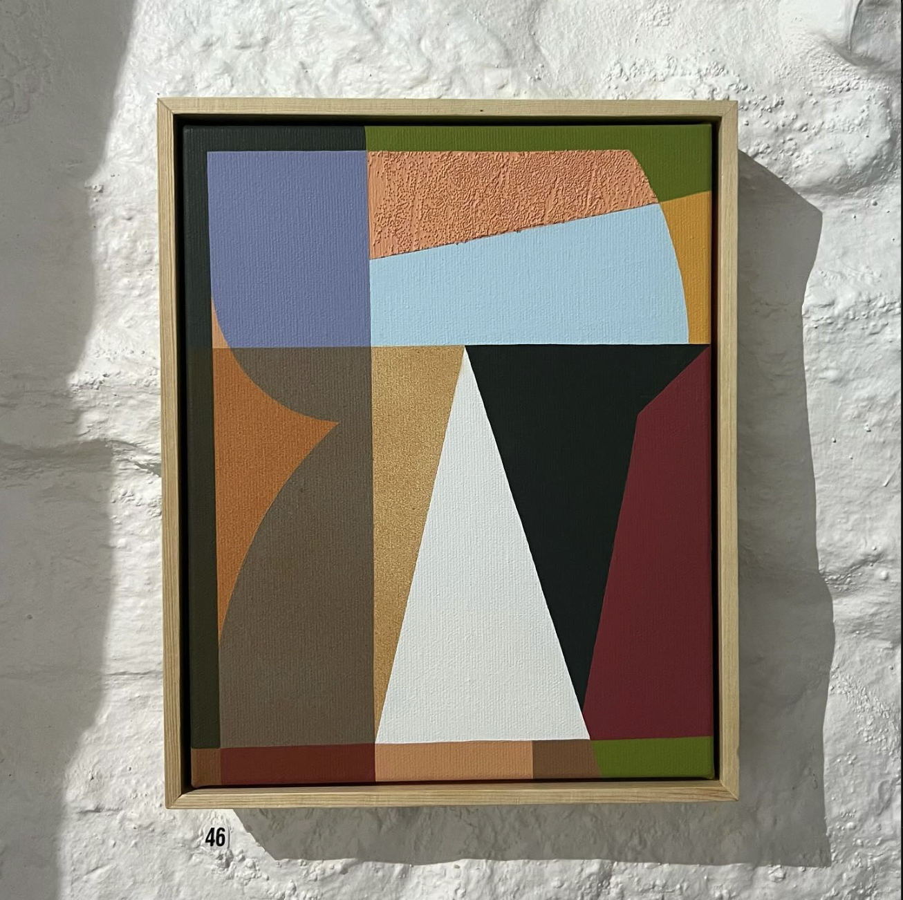
Hannah Coton
Hannah Coton's artwork establishes a dialogue between colour and shape articulated by abstraction and geometry. Her proposal evokes the natural through an effective selection of tonalities, achieving a visual synthesis perfectly adapted to the contemporary narrative.

Hannah Coton
Through shapes, you navigate in abstract landscapes that create a unique rhythm. How did your connection to abstraction begin?
When I was younger I enjoyed figurative drawing, and that’s essentially how my artistic journey started. Abstraction came up for me while I was doing my A levels at South Devon College. It became an experiment and a deliberate step away from the familiar territory of what I had been creating.
I just genuinely found it easier to create in this way and way more pleasurable as it always just feels quite...fun? I like to focus on enjoying the creative process itself rather than attaching a heavy conceptual meaning to it or obsessing over the finished thing.
Shapes feel fluid and intuitive to me now. Things definitely changed for me, though, when I studied screen printing at uni—the precision you have to have when setting out, the layering techniques, and playing with the opacity of shapes have all influenced how I paint today.

Hannah Coton archive
The dynamism in your pieces feels meticulously crafted. Do you plan these compositions using previous sketches?
I went through a phase where I focused on continuous line drawings, extracting shapes from them and using those shapes as the foundation for my work. Often, I would cut them out and rearrange them to create new compositions. Then, using tracing paper, I’d draw on top of the layer to refine and build upon the design. It initially began in a more chaotic way, but over time, my focus has shifted to carefully considering each shape and the painting’s colour palette, particularly how they interact with one another.
For a while I’d been using Adobe Illustrator as the first place I'd start when drawing for a new painting, there's the screen printer in me showing up, but more recently I've been enjoying cutting shapes directly out of different paper stocks and collaging as a way of drawing. It’s been eye-opening for me.

Hannah Coton archive
Your work reminds me of a puzzle—it’s amazing how you use similar shapes but create so many unique designs and compositions. Colour is a big part of what makes each piece different. You often stick to neutral tones, but there’s usually one bold, bright colour that brings the whole painting to life!
I definitely play a lot with this idea—the contrast between light and dark, bold and neutral. It's kind of a reflection of me I think as I have the extroverted side of me which people would mostly see, but I also have this quiet, introspective side which is just as important to acknowledge. I think a lot about the environment in South Devon I grew up in too - its wild seas, sandy beaches and bushy pathways have influenced how I choose colours in my work.
I genuinely think that since we don’t see much sun in the UK, we have to bring colour into our realities too. It’s interesting to talk about colour because I always thought I didn’t really understand it—and, oddly enough, I have a rare form of colour blindness. It’s called deuteranopia, and it affects only 1 in 200 women. I wouldn't say it's severe but I do struggle with some colour combinations! So, in a way, what I see in my paintings is something no one else sees which is quite special.
Hannah Coton archive
Tape is intrinsically linked to your painting practice, helping you create those sharp, clean colour surfaces. Can you tell us a bit more about how you approach your work?
My obsession with straight, clean lines is something that's really come through in the past 8 years or so. I’d been seeing people using tape to create these super clean cuts and for some reason felt a resistance to trying it as I thought it would mean I was cheating! I finally realized it’s just a material, the same as anything else I was using, and it totally elevated the quality of my work. Tape is a very practical tool for me now —I use it to mask off areas and then spray over the top, which gives this sort of window effect into the lower layers of the painting. I love the translucent spray paints because of their soft, dusty finish. I've also been getting into some acrylic mediums to create different textures and add more depth to my work which has been fun.
Some of my more recent works, such as those from my Reverberate collection, have been complicated to paint but I love sitting there and figuring it all out. As mentioned before, I often use Illustrator to draw my paintings before I touch the canvas. I break everything down into layers and paint each one exactly as it appeared on the screen, being super careful to make sure the colours are coming through true on the canvas as they do on screen. Some of my paintings have 10–15 layers. I start with a base colour for the background and then build up the following layers with different colours and shapes, paying close attention to how they overlap and interact with each other.

Hannah Coton archive
There is a particular interest in textures and transparencies in some of your paintings. Colours and shapes are juxtaposed to create cohesive and unified pieces. I’d love to hear more about these formal experiments.
I’m currently trying to move away from the computer and experiment more with analogue methods. The compositions that have come out of this process are things I would never have created digitally. I enjoy the challenge of layering, cutting shapes, and making them fit into the image. It challenges my perfectionist side because, when you're drawing in Illustrator, it’s easy to delete lines, and I'd sometimes get lost in trying to create the perfect picture. Trying to live more of a 'wabi-sabi' kinda life now and embracing happy accidents!"

Hannah Coton archive
Your work is deeply connected to mural painting. How did this practice begin for you?
I started painting murals with the Bristol Mural Collective - shout out to Rosa (Rtiika) who got me my first external wall spot on 'Muriel Alley' back in 2021. I was super lucky to be a part of that project, as someone who worked for an interior design studio saw that mural and asked me to paint three murals for a restaurant they were refurbishing in London. That was a great experience, although I didn't give myself enough time, but you live and you learn right? From that moment on, I developed a real interest in mural painting and have done a few pieces since in various spots. One of the most fun (and challenging, due to crazy winds) was at the Red Bull Curb Kings event down at Cabot Circus in 2022 - I decided to just use spray paint for the first time and the wind was just blowing it everywhere haha. I'm super excited to do more murals though and just make more exciting work in general in 2025!

Hannah´s mural at The Saint Bow Lane in London
❋ ENTREVISTA EN ESPAÑOL ❋
El trabajo de Hannah Coton establece un diálogo entre el color y la forma, articulado mediante la abstracción y la geometría. Su propuesta evoca lo natural a través de una eficaz selección de tonalidades, obteniendo una síntesis visual que se adapta a la perfección al discurso contemporáneo.
A través de formas navegas en paisajes abstractos que crean un ritmo único y dinámico. ¿Cómo empezó tu conexión con la abstracción?
Mi trayectoria artística comienza con el dibujo figurativo cuando era pequeña. La abstracción vino después, mientras estudiaba en el South Devon College antes de ir a la universidad. Esta búsqueda de un nuevo lenguaje se convirtió en un experimento para alejarme de lo que había estado haciendo hasta ese momento.
Sinceramente, me resulta más fácil crear de este modo, ya que la abstracción da pie al juego y a tener menos normas. Me gusta centrarme en disfrutar del proceso creativo en sí, en lugar de atribuirle un significado conceptual u obsesionarme con el resultado final.
En el presente, mi lenguaje es exclusivamente astracto y me siento muy cómoda trabajando desde la forma y el color sin recurrir a lo figurativo. Además, la serifrafía ha tenido una clara influencia en mi metodología de trabajo: la superposición de capas, las transparencias de la pintura y el ensamblaje de morfologías son las claves de mi obra.
El dinamismo de tus piezas parece orquestrado minuiciosamente. ¿Se trata de imágenes estudiadas con bocetos previos?
Pasé por una fase en la que me centré en dibujos de líneas continuas, extrayendo formas y utilizándolas como base. Después las recortaba y reorganizaba para crear nuevas composiciones y, seguidamente, dibujaba encima con papel de calcar para perfeccionar y ampliar el diseño. Antes tenía una metodología de trabajo más caótica pero, con el tiempo, me he centrado en estudiar detenidamente cada morfología y la paleta de colores del cuadro, observando la manera en la que interactúan entre sí.
Durante mucho tiempo, Adobe Illustrator ha sido mi primer punto de partida a la hora de dibujar para un nuevo cuadro. Más recientemente, estoy inmersa en un ejercicio de investigación de la técnica recortando formas en diferentes tipos de papel y organizarlos en forma de collage en lugar de dibujar y pintar.
En algunas obras se puede apreciar cierto interés en las texturas y transparencias. Los colores y formas se yuxtaponen para configurar piezas sólidas y con cohesión. Háblanos sobre estos experimentos formales.
Me gusta jugar con la siguiente idea: el contraste entre la luz y la oscuridad, lo vibrante y lo neutro. Creo que es una especie de reflejo de mi propia personalidad, ya que tengo el lado extrovertido que la gente suele ver, pero soy muy tranquila e instrospectiva. Mi trabajo, además, bebe de una evidente influencia del entorno natural en el que crecí, el sur de Devon (Inglaterra). Las playas de arena, el mar salvaje, la bruma, los senderos llenos de vegetación… Es un paisaje que me inspira a la hora de escoger colores y simplificar formas. Considero que, como en el Reino Unido apenas vemos el sol, tenemos esa necesidad vital de introducir el color en nuestra realidad.
Me resulta muy interesante hablar particularmente del color porque, a pesar de la relevancia que posee en mi obra, siempre he pensado que no llegaba a entenderlo. Curiosamente, tengo una forma rara de daltonismo que se llama deuteranopía y consiste en confundir determinadas combinaciones de colores. Con lo cual, podría decirse que lo que veo en mis cuadros es algo que nadie más ve.
El uso de la cinta de enmascarar está intrínsecamente ligado a tu práctica pictórica, lo que nos lleva a un proceso creativo basado en la formulación de planos de color perfeectamente delineados. ¿Podrías hablarnos más sobre tu técnica pintórica?
Mi obsesión por las líneas rectas y limpias me ha pasado factura en los últimos 8 años de producción artística. Veía a gente que utilizaba cinta adhesiva para crear cortes muy limpios y, por alguna razón, me resistía a probarla porque pensaba que estaba haciendo trampas. Con el paso del tiempo me di cuenta de que se trata de una herramienta de trabajo como cualquier otra y me ha ayudado a mejorar la calidad de mi obra, así como a agilizar los tiempos de producción. La utilizo para enmascarar zonas y aplicar pintura en spray por encima, lo que crea una especie de efecto ventana en las capas inferiores del cuadro. También me gusta experimentar con el acrílico para crear diferentes texturas y dar más profundidad a la composición.
Algunas de mis obras más recientes, como las de mi colección Reverberate, constan de un exhaustivo proceso de trabajo que englova varias fases: comienzo dibujando en Illustrator para tener cada color separado por capas, llegando a tener hasta 15 diferentes. Una vez me llevo ese diseño al lienzo, sigo minuiciosamente los mismos pasos y orden, siendo muy estricta con que la consecución del color sea fiel al boceto digital. Normalmente, parto de un color base para el fondo y, a partir de lo que me inspire, comienzo a construir las siguientes capas con diferentes colores y formas, prestando mucha atención a cómo se superponen e interactúan entre sí.
En algunos de sus cuadros se aprecia un especial interés por las texturas y las transparencias. Los colores y las formas se yuxtaponen para crear piezas cohesionadas y unificadas. Me encantaría saber más sobre estos experimentos formales.
Empecé a pintar murales con el Bristol Mural Collective (Colectivo de Murales de Bristol). Un saludo a Rosa (Rtiika), que me consiguió mi primer mural exterior en «Muriel Alley» en 2021. Tuve mucha suerte de formar parte de ese proyecto, ya que alguien que trabajaba para un estudio de diseño de interiores vio ese mural y me pidió que pintara tres murales para un restaurante que estaban reformando en Londres. A partir de ese momento, empecé a interesarme por la pintura mural y desde entonces he pintado varias paredes en distintos lugares. Estoy deseando pintar más en la calle, a gran escala, decorar espacios y continuar creando y descubrir nuevas técnicas y narrativas.